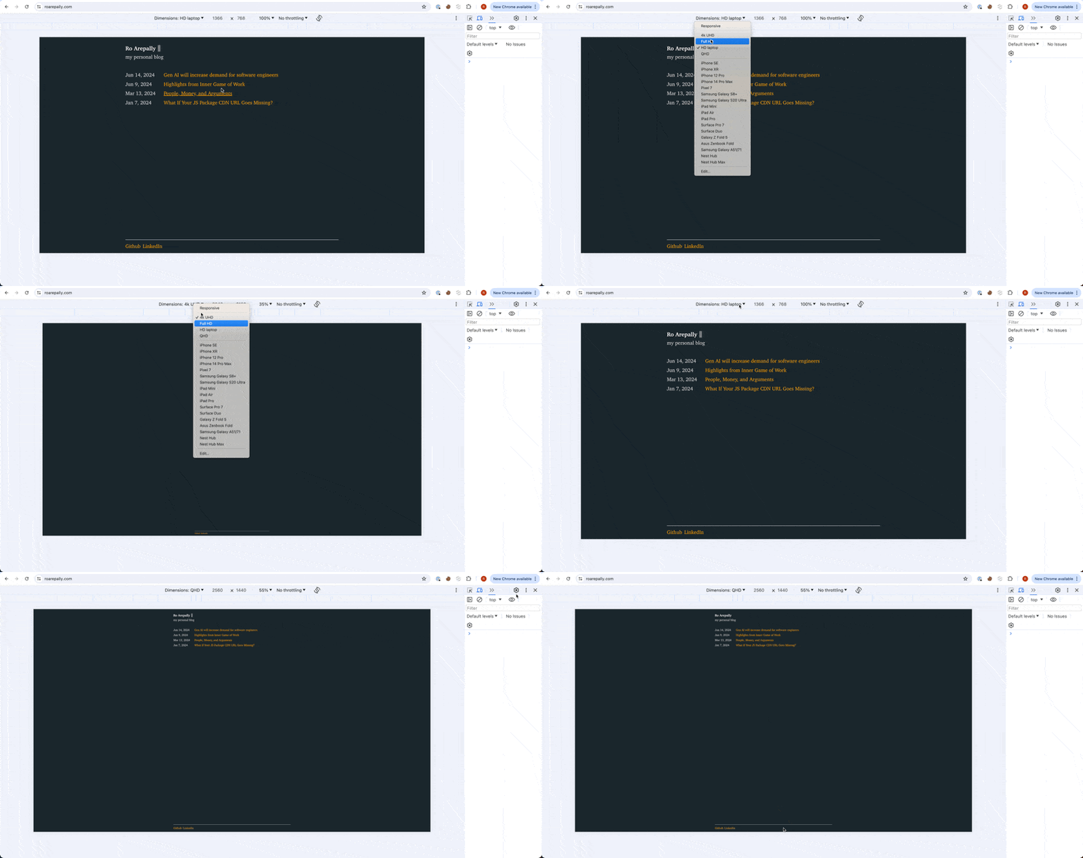
An obvious but easily missed feature of emulated devices (Chrome DevTools)
July 22, 2024
Chrome DevTools allows you to specify your own custom devices to emulate. This is useful for web engineers, because something that looks good and is intuitive on one screen size might be completely broken on another.
Most commonly, I’ve seen developers use this to see how the page renders on a mobile view.
However something I didn’t consider until recently, is adding custom desktop screen resolutions to test. Up until now, I would just resize my window by hand to check different width/height combinations.

My custom devices are based on the most commonly used desktop/laptop screen resolutions (source). Now I can easily see what the majority of users will experience on my site.
The four emulated devices I customized are:
- 1366 x 768 (HD Laptop)
- 1920 x 1080 (Full HD)
- 2560 x 1440 (QHD)
- 3840 x 2160 (4K UHD)
While QHD and 4k UHD are not the most common, they are popular for people in tech (the target audience of my employer).
bonus tip: You can also customize the user-agent. So if you want to test the experience of a Windows user on a Mac, then it’s easy to do that!